


Behind the Scenes: Cover Art
ft. the one and only Evangeline Gallagher

This newsletter just hit its 2000th subscriber - yay! Thank you all for your support. So while we’re all waiting for the cover reveal of my adult debut You Weren’t Meant to Be Human (which you can PREORDER NOW), I thought I’d take a moment to talk covers.
At the time of writing, all three of my (revealed) covers - Hell Followed With Us, The Spirit Bares Its Teeth, and Compound Fracture - have been done by the delightful, wonderful, endlessly talented Evangeline Gallagher. I spent so long dreaming of the perfect covers, and let’s be frank, I got them. (I mean, look at these! What more could I have asked for?)
And almost every author dreams of the perfect cover. How romantic is it: a piece of artwork that perfectly encapsulates your story. It’s almost mysterious. Before I went through the process, I had no idea what to expect.
So let’s de-mystify the cover process.
This is a long one! If you’re reading this in an email, you might need to select “view entire message” at some point.

Reminder: Book Covers Are Tricky Business
I’m going to be blunt. Every time I talk in-depth about the cover process, it seems to turn at least one person off the traditional publishing track.
“What do you mean I don’t get the final say on my cover?” they say.
Sorry. That’s just how it is.
Covers feel mysterious and romantic, but just like the rest of publishing, it’s about finding a middle ground between art and sales. A cover that moves copies is more important than a cover that’s artistically inspired or beautiful. And besides, if you’re at this part of the process, a publisher bought the rights to your book. That means the decision on your cover is ultimately theirs.
Now, I’m not saying you get no say over your cover at all. Almost every team will give you some say, and a few (like my publisher, Peachtree Teen) will let you really get in there. They don’t want you to hate your cover. Still, the bottom line is, the cover is an advertisement for your book - so when the marketing & sales department speaks, the art & design department listens.
With that out of the way…
Hell Followed With Us
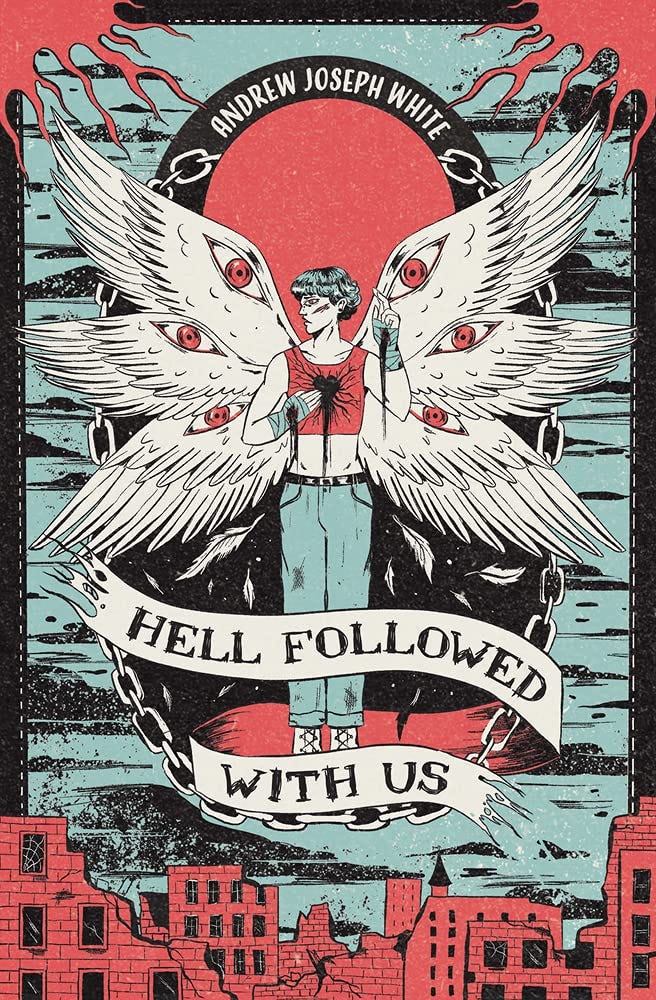
The first thing my editor did was build a cover concept document, which I was able to find in my email history. It included a list of possible artists like Andres Rios, Billelis, and Aykut Aydogdu, plus a collection of comp covers, such as Lore and Soulswift. It also featured a few snippets of the manuscript - only about ten pages. That was the day I learned that the cover artist doesn’t read the book! I got a chance to review the document, but frankly, I didn’t have much to say or add.
Then my publisher brought a designer on board, handed her the document, and let her rip. That designer, by the grace of all that is beautiful and good in the world, reached out to Evangeline Gallagher, and the contract was signed.
(Did I get a say in my designer or illustrator? Nope. Could I have kicked up a fuss and gotten minds changed if I was really unhappy? Idk, maybe.)
Next came concept sketches. Unlike my other two books with Evangeline, the sketches were never posted publicly - or if they did, I can’t track them down. But I did receive them, all in their messy purple-blue glory: one prominently featuring Reformation Evangelical Church, one focusing up close on Benji’s face, and one showing Benji with metaphorical wings outstretched. It was a shock. So many options!
I was asked to rank the covers, explaining what I liked and didn’t like about each one. The favorite elements were then combined - to marketing’s liking, of course - and sent back to my editor and I for approval. We went back and forth a few times regarding pose, specifics, etc. etc., until we came to the final cover you see above. I was blown away. How lucky I was! I couldn’t have asked for anything better.
The Spirit Bares Its Teeth
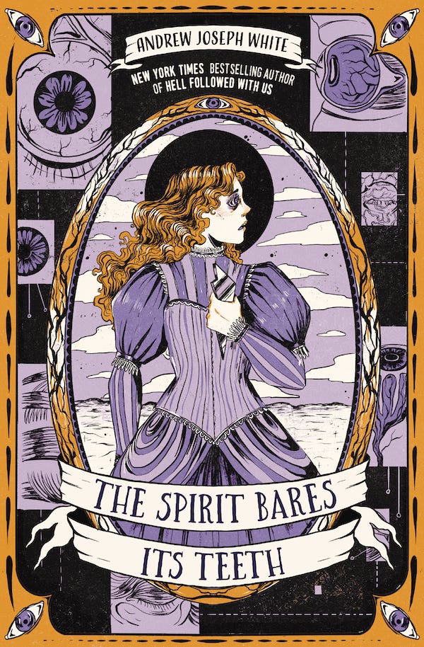
I’ve mentioned before that this book was a nightmare to write. Such a nightmare, in fact, that when it came time to start working on the cover, I can’t say with certainty whether my editor had actually read any of it or not. But, you know what! That was fine. We could make it work.
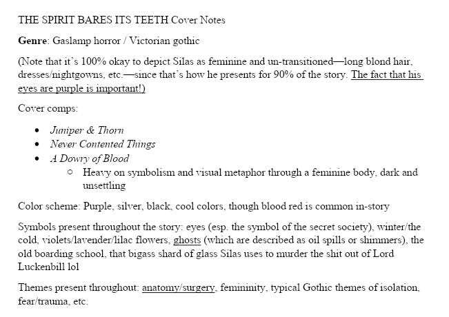
Evangeline, a blessing, was coming back to do the second cover. The design team also knew they wanted the cover of TSBIT to evoke HFWU while still being its own thing - borrowing design elements and structure but not really copying. So instead of putting together a design document, my editor Ashley reached out to me with a mountain of trust. Could I please put together a quick memo of what I wanted on the cover?
Below is a screenshot of what I turned in. The whole thing.
And, this time, we have COVER SKETCHES to show what Evangeline did with this tiny little memo!
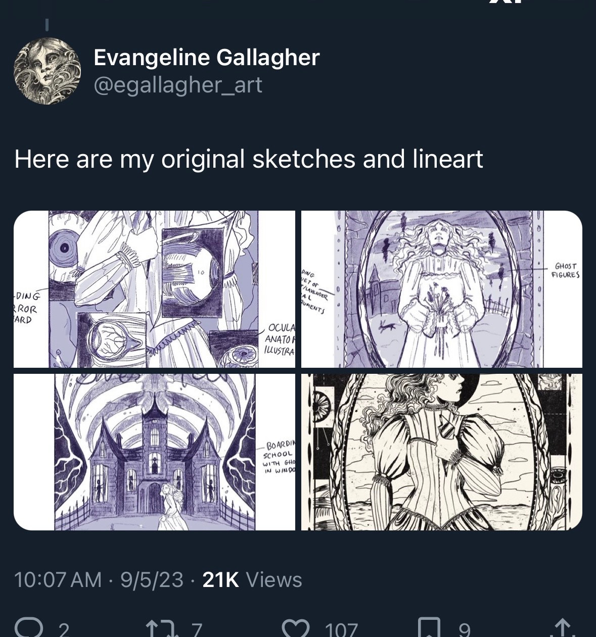


I loved all these options dearly, but the first one really stood out to me. I was in love with it. The anatomy, the pose, the horror of it all! We combined it with the frame of the third one, and we were off to the races. Evangeline, my editor, the design team, and I were beginning to understand each other. To really click. And that kind of relationship is a beauty.
(Funnily enough, in our first attempt at a final cover, we opted for an extremely pale powder yellow - and marketing overruled it! They insisted on something bolder. I was cranky at first, but the gold really shines. I have to admit, they were right.)
Compound Fracture
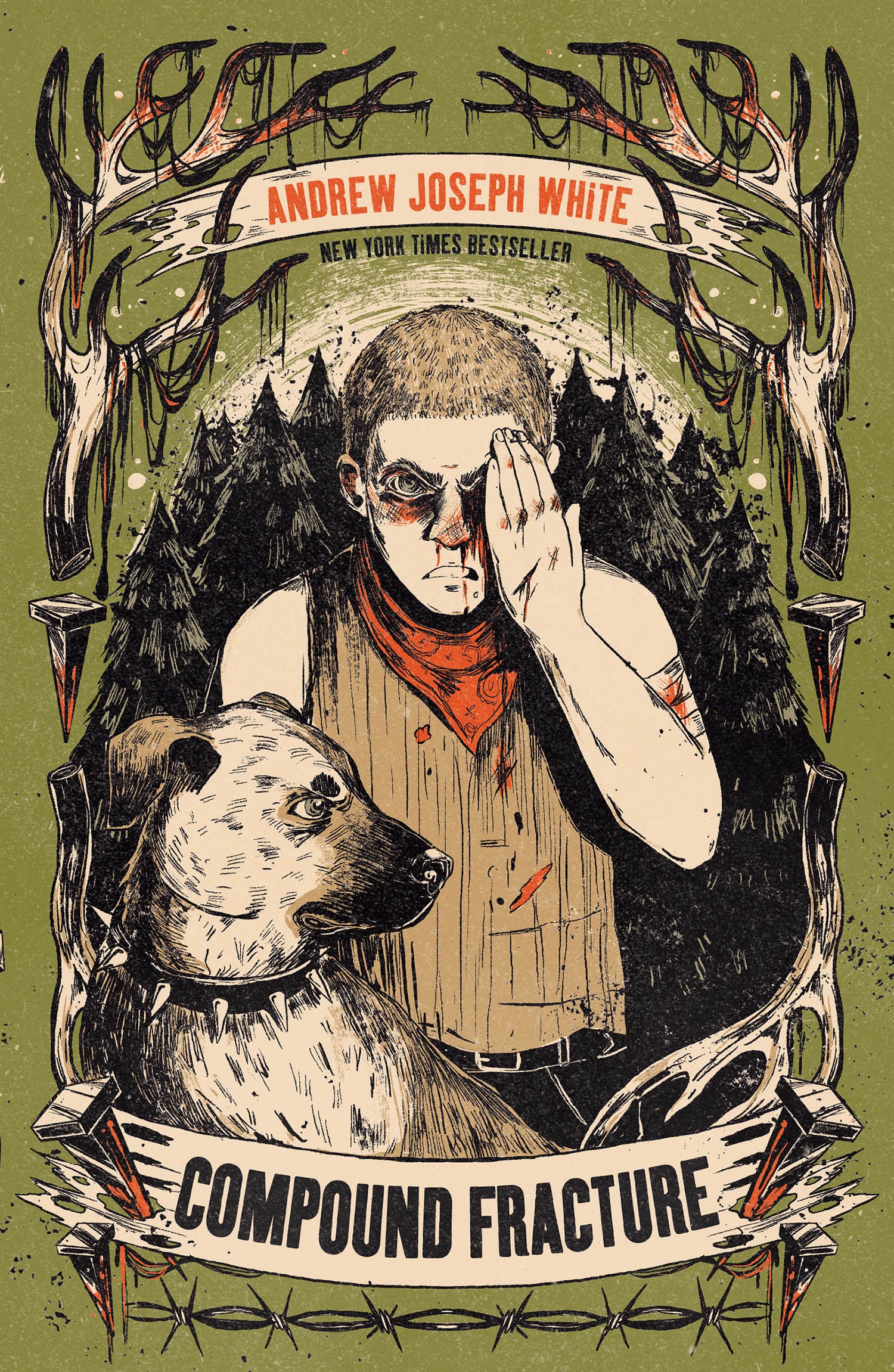
Figuring out the cover of this book was a whole thing. Again, we had Evangeline, and we were going for another “frame with a central figure” cover. But my design memo was so miniscule I didn’t even bother to save it, and the color scheme! Oh, the color scheme. The book was so distinctly green and brown, but those wouldn’t be enticing on a bookshelf. Red was also prominent, but green and red would make it look like a Christmas book? Which, no thank you.
But then my wife texted me a photo of some orange Sharpies. “You know, like a hunting vest?” And the speed with which I sent it to my editor could have broken the sound barrier.
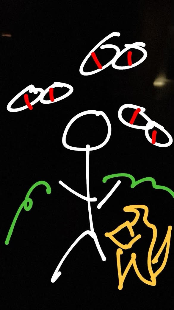
(My wife also drew a prediction of what the cover would look like; see below. I don’t think she was that far off…)
And then, because Evangeline is an artistic genius, here are the cover sketches we received:
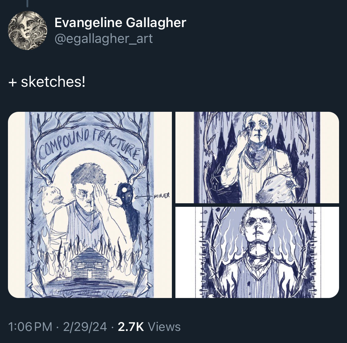


As you can see, we’d found our stride. These concepts are a lot more cohesive than previous ones, since Evangeline had an idea of what we’d want. That meant choosing my favorite elements of each one got a lot tougher! I was really getting down into the nitty-gritty with my responses - but as I mentioned previously, Peachtree Teen gives me a lot of say re: my covers, and they were more than happy to talk with me about the specifics.
And what about your next book?
Well. We’ll just have to see, won’t we.
I can tell you now that my involvement in the covers hasn’t been as in-depth. My editor put together an inspiration packet, I received a portfolio of options, I made suggestions. But Saga Press at Simon & Schuster is so much bigger than Peachtree Teen, and the decisions are higher stakes, and I was fully aware that I’d get less control over this time around. It was important to make peace with that.
But. I can tell you that the cover Saga Press eventually presented to me is amazing. It’s grimy, it’s icky, it’s old school, and it’s so cool. I can’t wait to show it off.
Other reminders
Want to see me doing stuff and talking to folks? Keep an eye on my events page. I currently have talks and signings across Virginia, West Virginia, and Washington DC.
Compound Fracture won a 2025 Printz Honor on January 27th, a silver medal for one of the most prestigious literary awards in YA. The Spirit Bares Its Teeth paperbacks drop May 6, 2025, and Barnes & Noble has an exclusive edition with sprayed edges and a new chapter from Daphne’s POV. I also have two more YA novels coming out through Peachtree Teen in 2026 and 2027; You’re No Better and Beast//Warden.
Plus, Hell Followed With Us is getting a movie, thanks to Lilly Wachowski (The Matrix) and Powerhouse Animation Studios (Castlevania).
HOW DID I NEVER REALIZE THAT WAS THE SHARD HE KILLED LUCKENBILL WITH OMG I feel stupid now lmao
Also I need you to understand the second I saw compound fracture’s cover I was ecstatic that green and brown is my favorite color combo ever and the orange/red is such a great contrast
I always show up for AJW content, im so grateful for queer authors like you!